

I am always surprised at how the fashion and fabric industries force new trends on designers, buyers and clients. I understand the need for the ‘new’ and ‘the race for clients’ with fresh collections. But colour is such a personal thing.
My Mum, who is a historian of art, says that there isn’t a wrong colour, there is only a colour in a wrong place, and after years of working in the art and design industry, I have learnt that she is absolutely right. Another thing that I learnt is that the classics never disappoint.
As much as I understand this need for colour trends in fashion, I feel that in home furnishings colours should reflect personal preferences and not be forced by what is dictated, just for sake of it.
My clients still prefer to live surrounded by colours they feel comfortable with. And what is comfortable varies from person to person. I like to play with colour and only use what I think works in a pattern. I do not chase the newest trends but experiment a lot with different combinations and when I like it, the decision has been made.
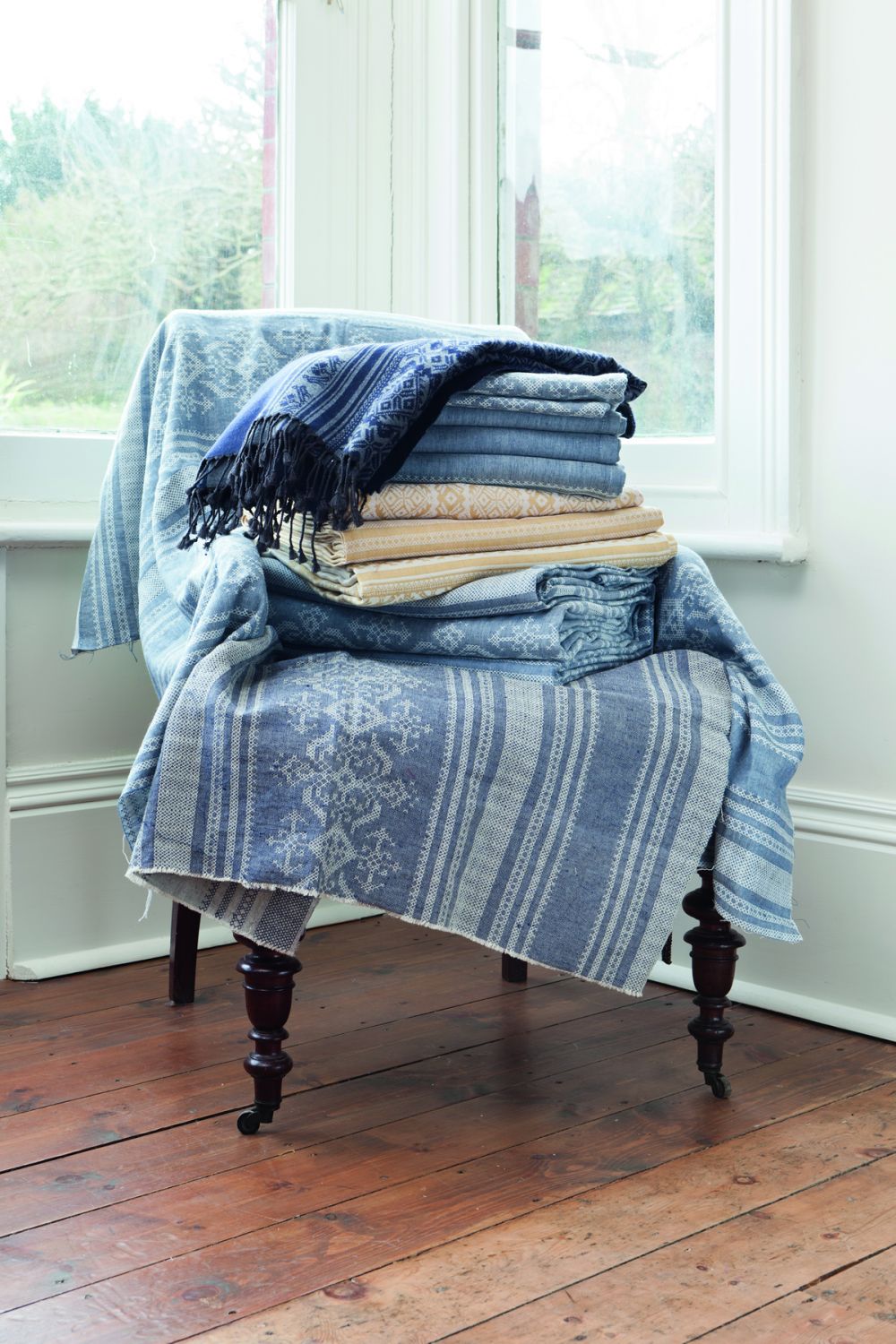
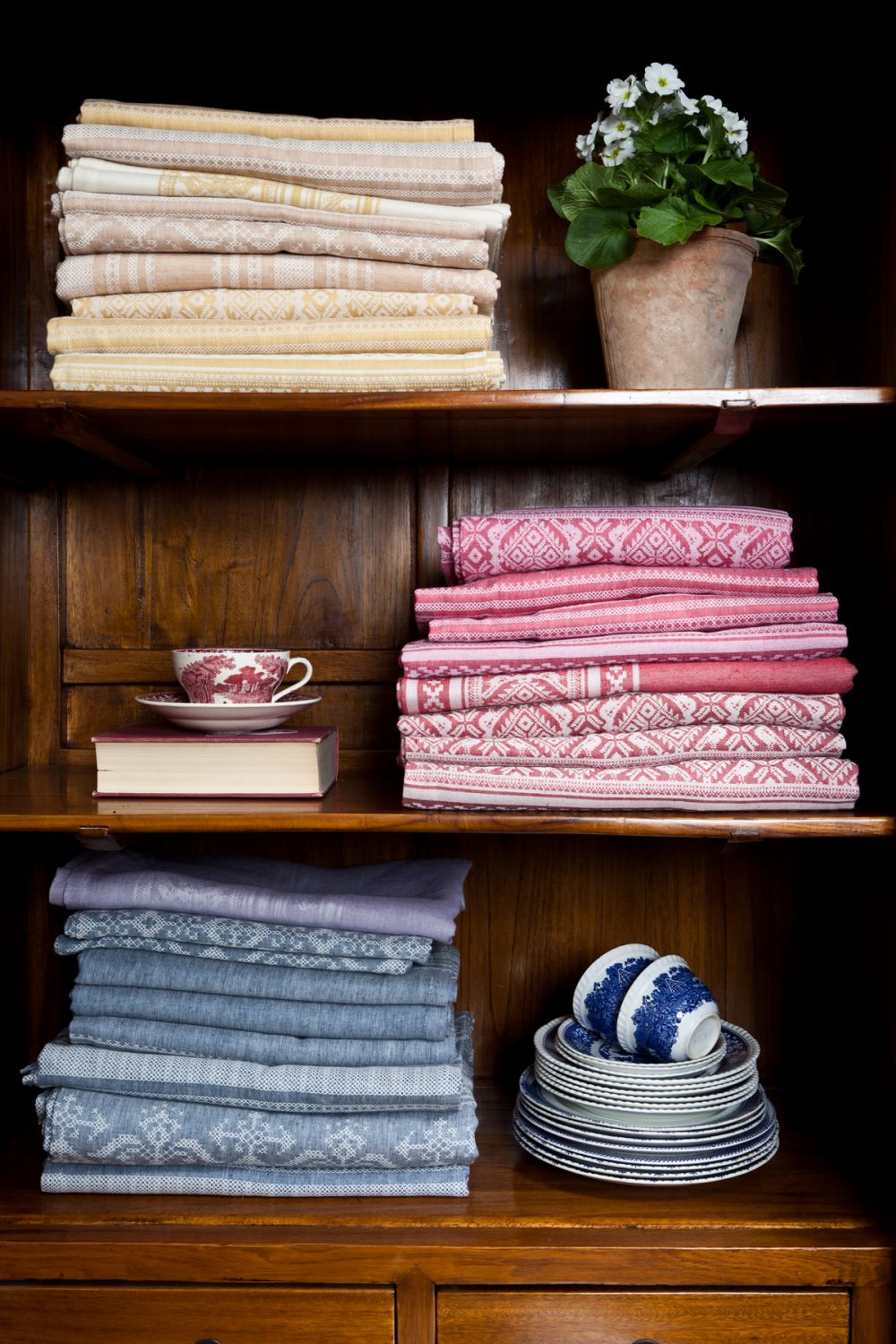
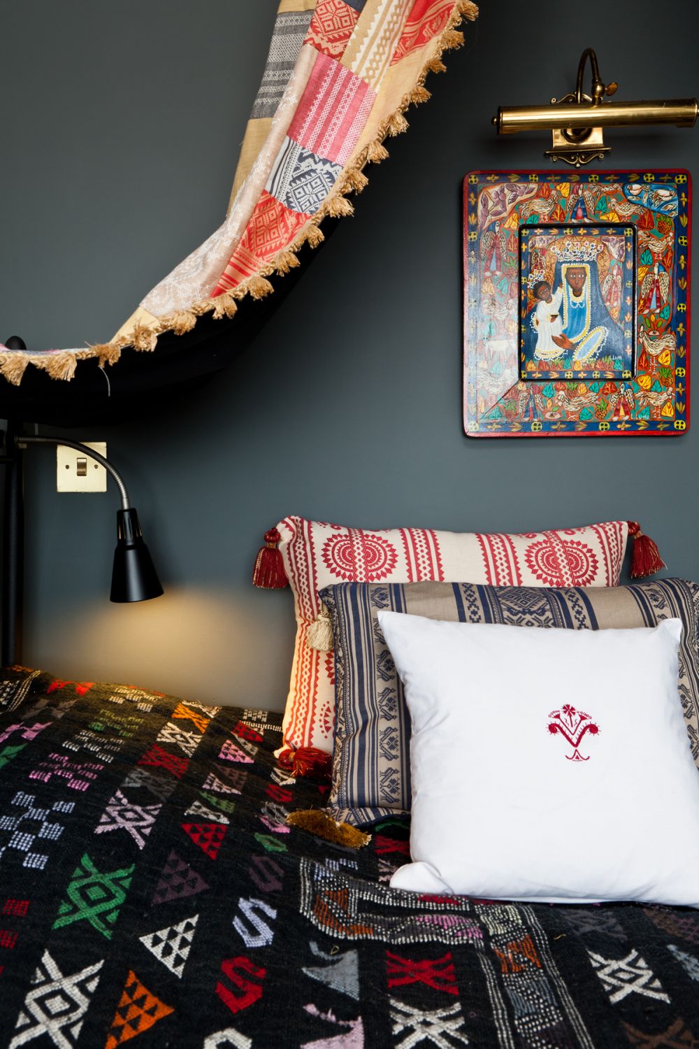
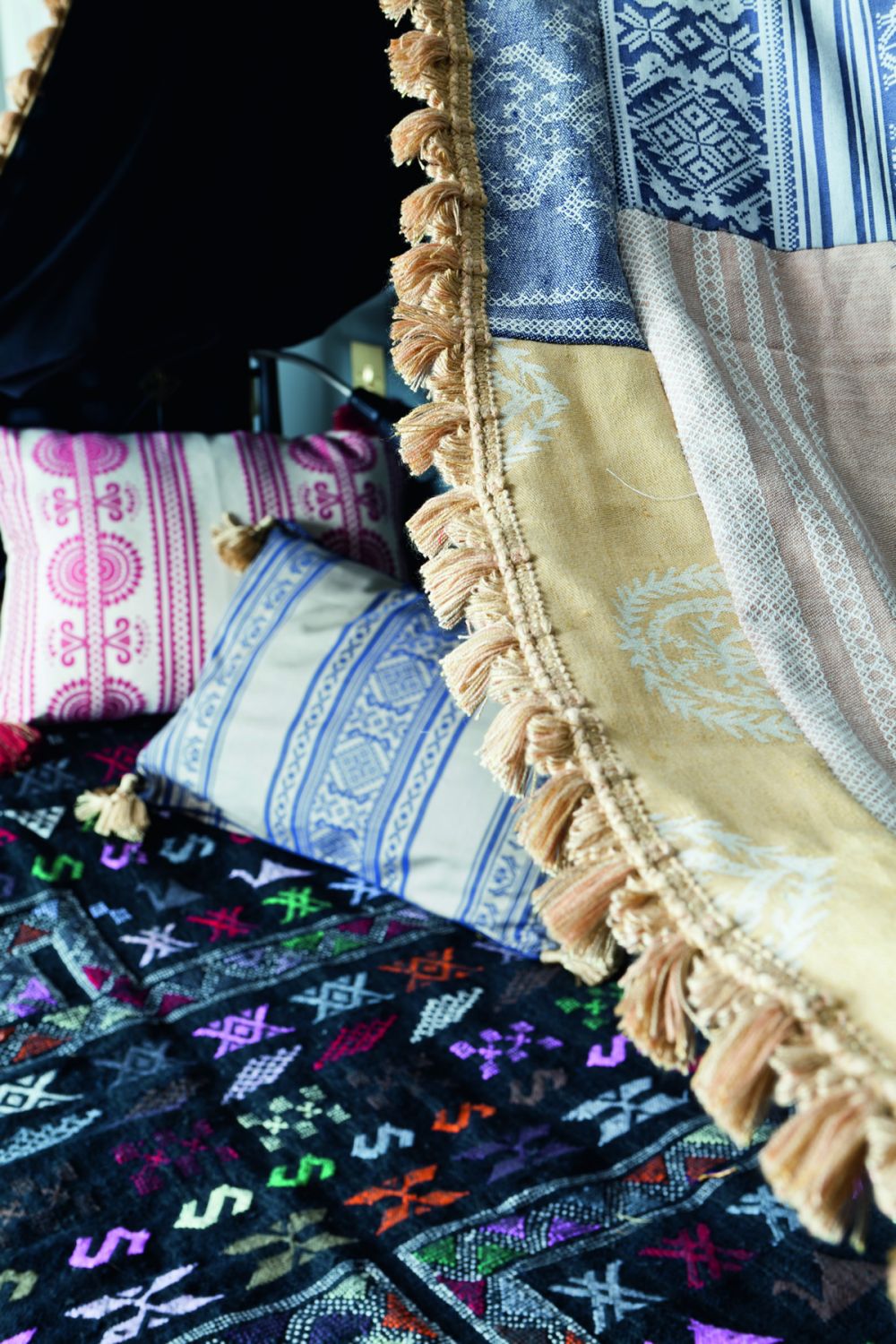
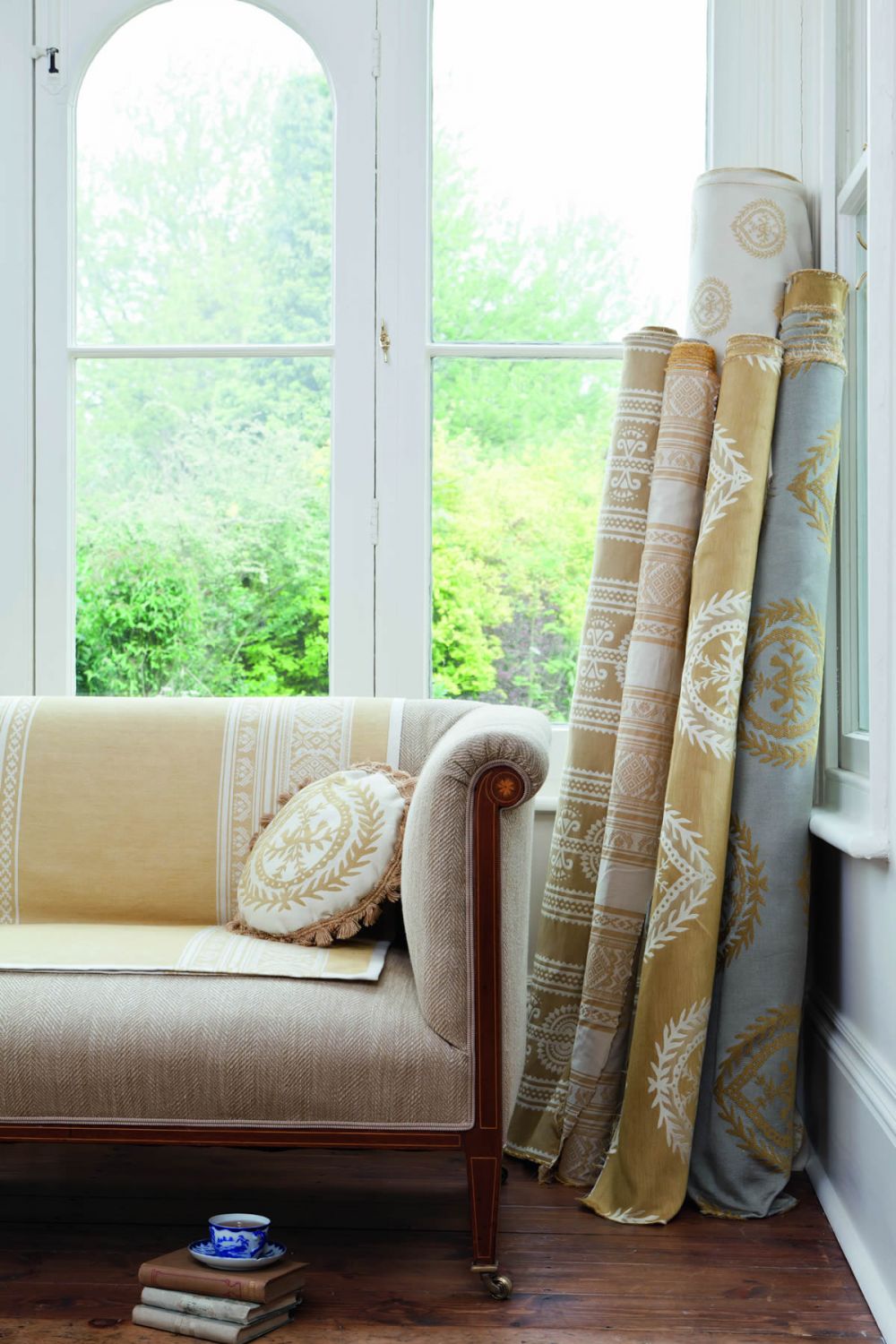
I may be wrong, but when I design I do not look at other people’s work as I do not want to be influenced or tempted by colours that someone else thinks may be fashionable this year. I want my fabrics to last a bit longer than that. So, although I use a lot of classic colours like golds, blues and reds I also try to contrast them with more controversial ones and see what emerges. I also do not like to use too much grey. I think there is enough of that in our daily lives.
I think that every designer’s duty is to be truthful to his or her own vision. Following a trend is lazy and compromises individual talent and is nothing more than playing it safe.
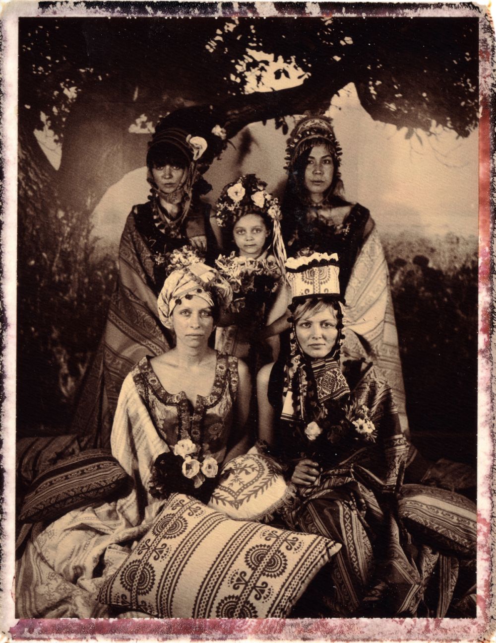
You cannot please everyone and what I have found with my colour ranges is that they work for some and not for others. I’ve been told a few times that my colours are ‘not English enough’. Indeed, they shouldn’t be because my current collection is inspired by different cultures where colours are more vibrant, more surprising and inspiring. Others love them and are excited about seeing something truly different.
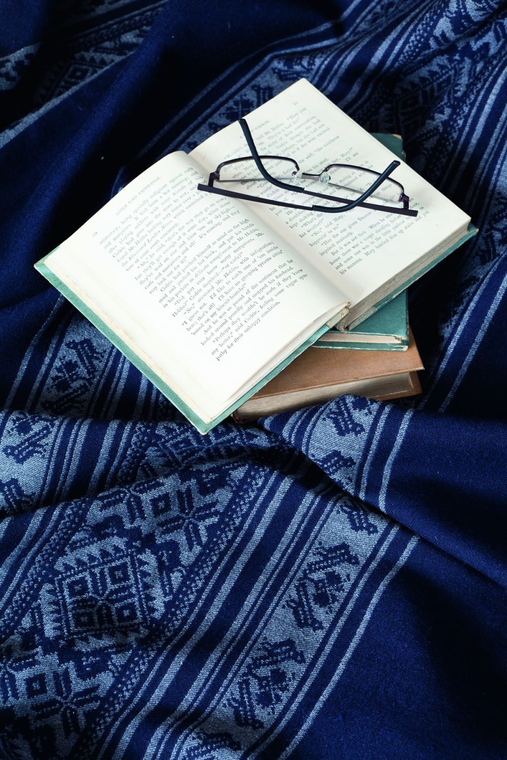
People see colour in different ways depending on their geographical locations and cultures. In Africa for example, greens and blues are seen as almost as the same colour and in fact, there is also less terminology in local languages to describe these colours. As a contrast there are more oranges and reds in the landscape so people see those colours better and use them more and the vocabularies reflect this. Where we live, especially in the UK, we see colours in hues of blue, almost through a misty grey filter and this is probably why people will always be drawn and feel at home with bluey-grey palettes.
I looked at the newest trends in colours for the purpose of writing this article. It looks like there are lots of colours that I have included already in my designs. It only shows that colours come and go, just like trends in fashion. I will continue to choose what I think is right for each design and project and hope there will always be people who can see through my eyes.