

Many people have lost their nerve when it comes to using colour, but there are signs that confi dence is returning. One only has to think of the bright blues, greens and yellows of the Aesthetic Movement or the riot of colours favoured by the Prince Regent to see just how much people now shy away from the use of bold and vibrant tones. Instead they fall back on a ‘safer’ neutral approach which has led the trend for the white, ‘non-colours’ that are so prevalent today.
A good shortcut to a better understanding of colour is to look at your favourite painting and examine what it is in the colours that you like, or simply imagine a beautiful garden in full bloom. Both probably combine a lot of different colours that you would not necessarily think of using together.
Antique rugs are often a good source of surprising but successful colour combinations. You can also get inspiration from one of the many wonderful fabric design houses such as Pierre Frey, Claremont or Rubelli. They demonstrate how colour works with pattern and how contrasting colours can often make a design scheme sing. Using a colour on the opposite side of the colour spectrum to the primary shade you are using can make the whole scheme sparkle.
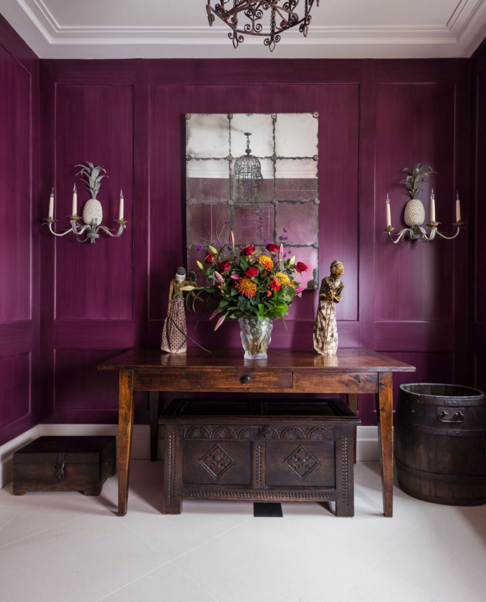
Neutrals and beiges have now become old hat, and clients are growing in confi dence and creativity - more determined than ever to avoid the bland ‘showroom’ look. For example, we recently painted the hall of a home in London a deep aubergine, which not only creates a memorable first impression but also sets the tone for the rest of the house.
Another client has a wonderful and divergent art collection that is so colourful it proved difficult to find a palette of colours which allowed all the pieces to shine. So, for her, we did create a relatively neutral background, but we then used strong accents of colour to complement the various artworks.
There is no need to be scared of stronger colours as long as you combine them with clean architectural details. If you are still nervous of using them, then lacquer has a wonderful reflective quality which lightens the tone by reflecting the light around it, while adding drama at the same time. Different paint finishes can also change the character and feel of a colour. From matt or distemper to eggshell or gloss, a single colour will appear differently in each finish, providing a wide range of options to play with. Specialist painting can also be used to great effect when multiple layers of different shades are built up.
No approach to colour is right or wrong, it is ultimately about personal choice and the scheme you choose should reflect that. So, ask yourself whether you are a bold colourist or a subtle colourist - or are whites and neutrals your natural habitat?