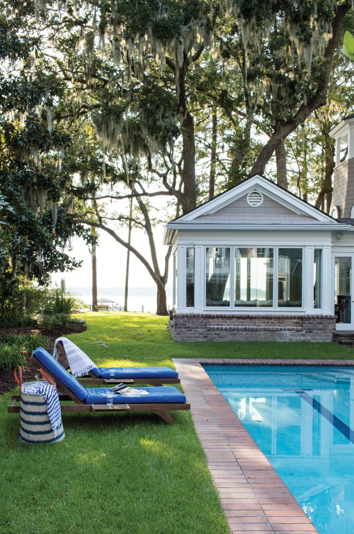


There are some matches that just seem like they’re made in heaven. In my opinion, blue and white is one of them - and to me, it also feels innately and classically southern. That could be because blue is the hue that we see most around us every day in our environment. Our southern skies are so oft en a bright, clear wash of aqua, interrupted only by white clouds that remind us of cotton. Many of us in this region also live close to the ocean, a lagoon, a lake, or a river.
Blue comes in an almost endless variety of tones, which our vistas show us so magnificently: indigo as the last light dies at sunset; cobalt in the lobelia just beyond the front door; the Wedgwood blue of hydrangeas; the powder blue of early morning skies and the slate-tinged grey-blue of the Atlantic in Winter months.
Since blue is also on the cool end of the colour spectrum, it does actually feel cooler to walk into a blue or blue-and-white room, especially when the temperature tops 100 degrees Fahrenheit on a sizzling hot Summer’s day.
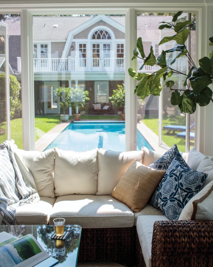
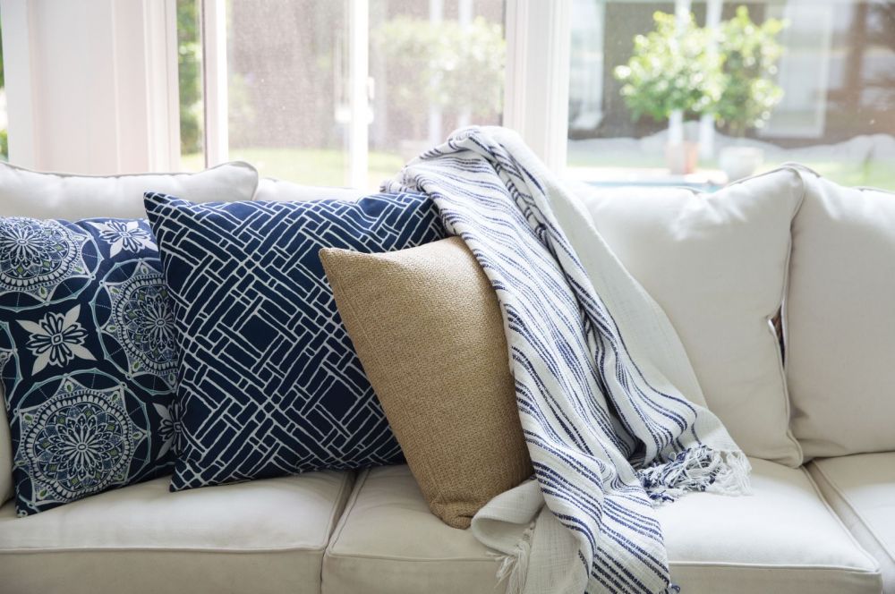
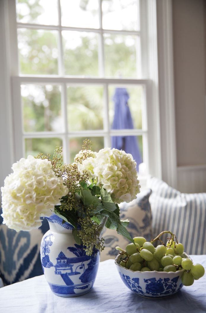
Blue-and-white accessories are very collectible and classic southern favourites. This makes sense, historically speaking: as our forebears sailed around the globe, they regularly brought back home the fine works they discovered abroad. Not least among them were the porcelains and ceramics in blue and white that now adorn so many of our historic houses. I have always found it fascinating that although the patterns differ, the palette itself unites cultures as far flung as the Chinese, French, Portuguese, Dutch, Danish, Japanese and Moroccan, just to name a few.
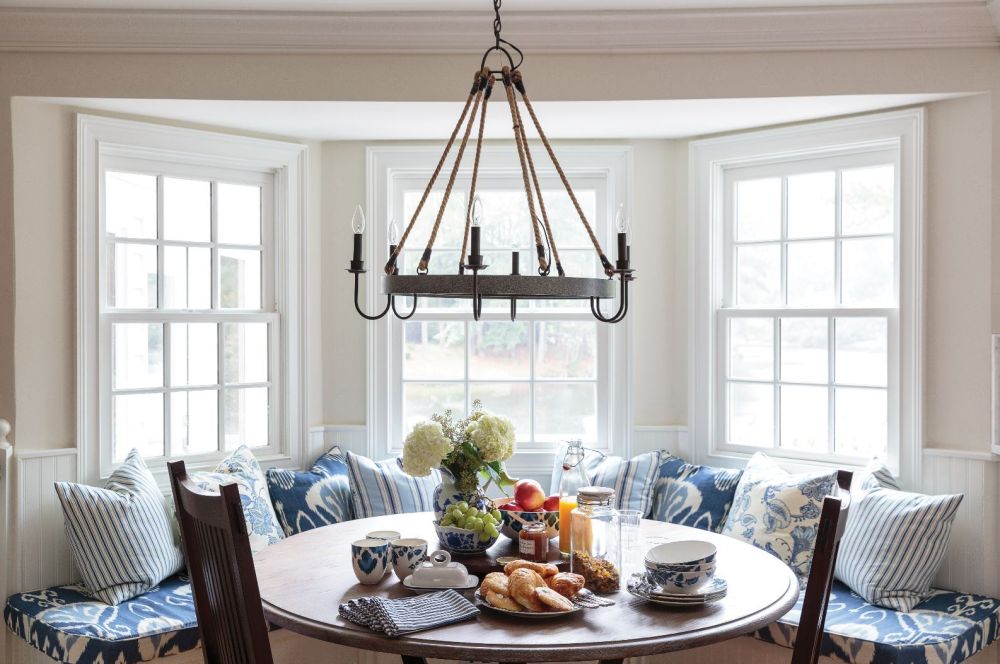
Psychology indicates that blue surroundings allow the brain to become more creative which suggests to me that the colour has a relaxing effect. In my experience, everyone responds quickly to blue-and-white fabrics in all sorts of patterns, from stripes to nautical themes, from nature views to geometrics and more. Our coastal clients very often prefer the combination of blue and white to any other. And that makes sense to me. In linen and cotton, blue- and-white designs look sharp. They are fresh, crisp and clean and make a room feel bright and happy. One of my clients in Florida, in fact, has asked that I use blue and white, and only blue and white, in her homes - and I’ve now done that in the three I have designed. With her, I feel that I have used every blue-and-white fabric that exists.
Ever since the ancients discovered pigments and dyes, the marriage of blue and white has been an enduring motif in the decorative arts. For many designers, myself included, the two remain a perfect pairing. From inky indigo to ice blue, from broad stripes to narrow bands, from intricate geometrics to complex fl orals, the range of possible hues and patterns is endless. Their juxtaposition also feels to me like a part of my southern heritage, perhaps because it ties us into this landscape of water and sky. Blue and caramel is another of my favourite combinations.
Here is another perplexing truth: colour can, and does, change depending on environmental factors. From one time of day to another, from one location to another - meaning surroundings, longitude, and latitude - the same colour can seem to be a different hue entirely. The living room walls of my family home on Hilton Head Island exemplify that kind of changeability. When people ask me for the paint colour, which is grey, I give them the paint chip. Their response, always, is, “no. I want your blue.” Now, our house is right on the water, and our living room focuses on that view. We get a great deal of natural daylight, as well as reflected light on the water. Because of where we are and the quality of light that fills the room over the course of the day, that grey reads as blue. At night, it becomes another colour altogether. Th at’s why I always advocate adapting the palette to the place as well as the person.