

You can park any preconceptions at the stone portico and get ready for a home that zings with colour and energy at Rebekah and Nick Caudwell’s Georgian townhouse.
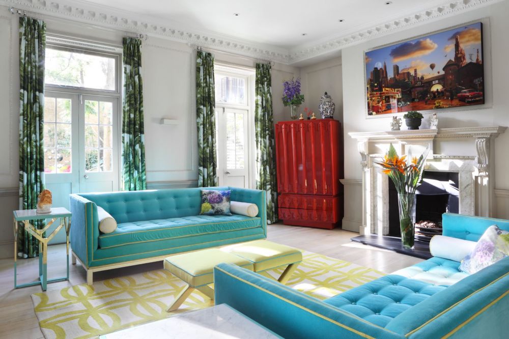
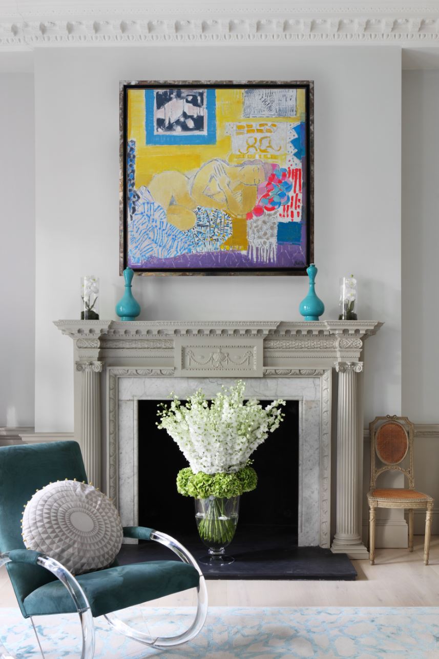
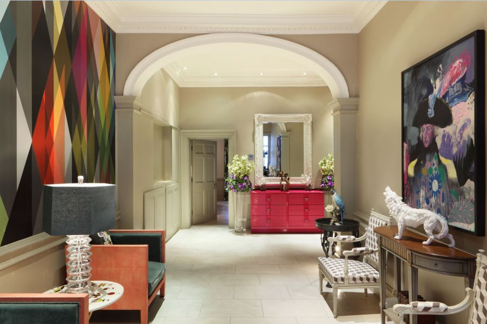
“I like to break a few rules,” says Rebekah. “Because sometimes that’s how you have the most fun.” Her vision for this Grade II listed townhouse starts right in the flagstoned entrance hall, where one wall is vivid with crosshatched bolts of magenta, turquoise and yellow, matched by peachy chairs and a console in glossiest pink. “I want to go for the element of surprise, the moment you open the front door,” she smiles. Beyond an austere façade, the look of this Georgian home is joyous and energetic - more Palm Springs than bookish Bloomsbury. “I put colours together so they sing,” Rebekah adds. “Your home affects your mood, so why not make it a happy place?”
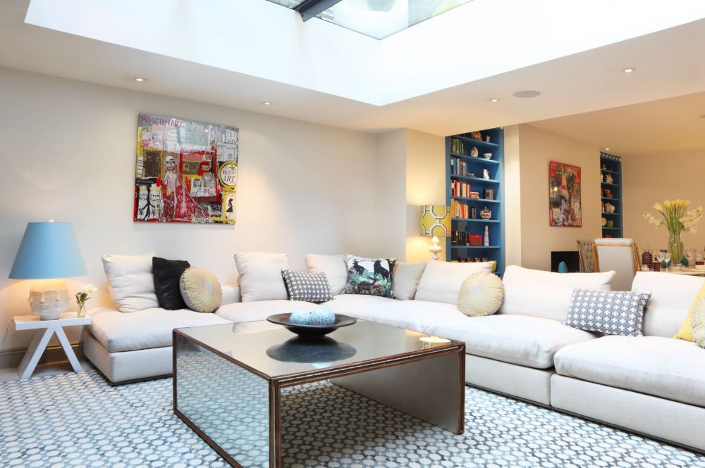
“Nick helped drag me out of the 18th century and into colour,” says Rebekah. She points to a favourite corner of their basement-level hangout, where the poise of a Vermeer print mixes with a svelte Italian Fifties chair, while impossibly tall Georgian windows are swathed in a Pierre Frey’s tropical fabric that could be straight out of a Slim Aarons still.
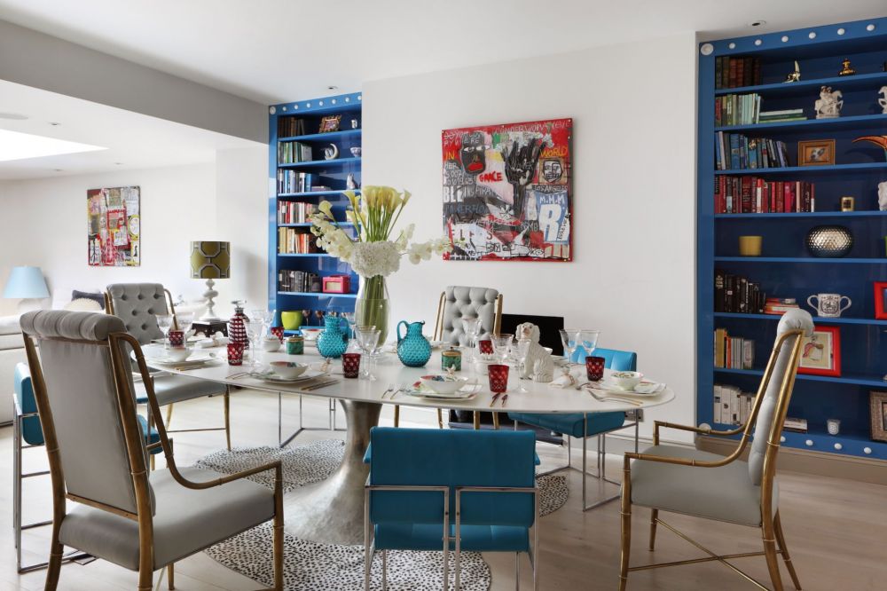
“For Nick, mid-century modern is his version of classic,” says Rebekah. “He has images of Californian desert glamour hardwired into his system: that cool, chlorine blue, citrus yellows and zingy greens. So he got me hooked.” In return, Rebekah demonstrated to Nick how balanced classical compositions continue to earn a place in contemporary interiors. “We’re a good team,” says Rebekah.
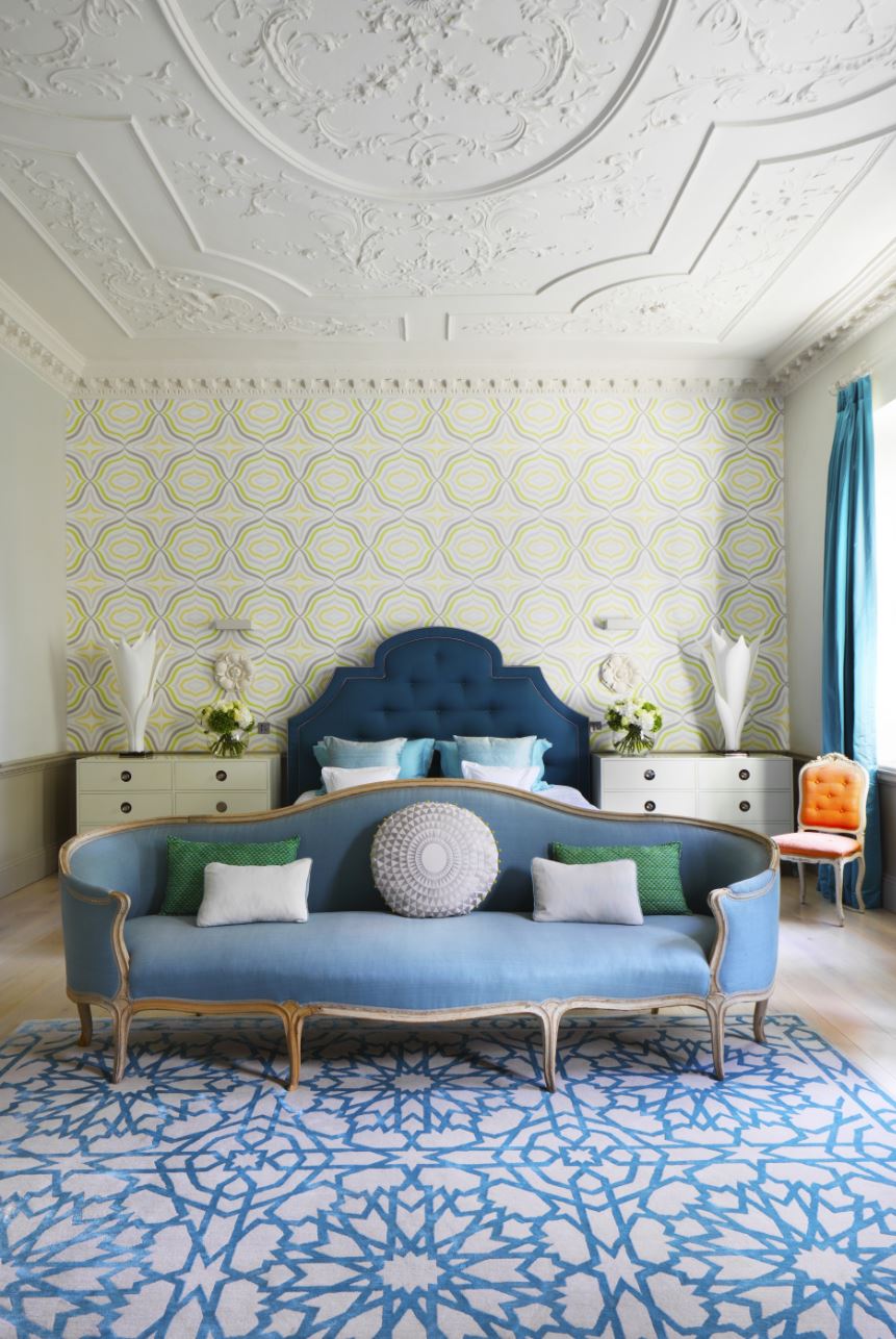
Bold statements work best on a grand scale, so the proportions of this London home seemed an opportune setting to inject some bold US-style colour. This flat-fronted 1790s house, had been used as accountants’ offices during the sixties and seventies, before being turned back into a single home. “Thankfully, it survived the Seventies mania for ripping out original features,” says Nick. “We both got that “wow” moment when we walked into the reception room – and then again when we saw the master bedroom,” he adds.
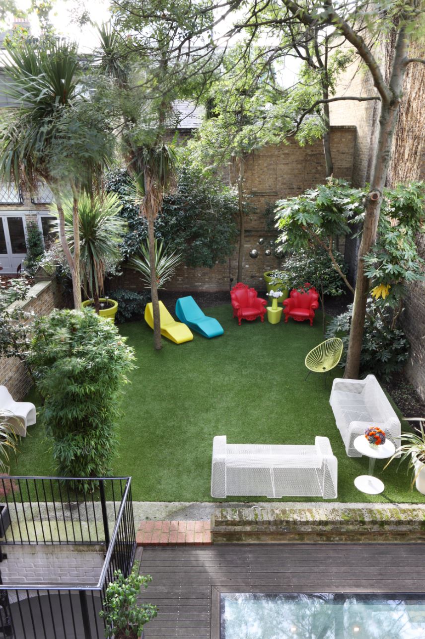
“It was the perfect space to start over,” says Rebekah. First off, they threw out the polite greys and taupes, sanded back the floorboards and dipped into a palette of sun-soaked turquoise, teal and greens. She’s not averse to a mix of high-low budgets, too. “I head to Graham And Green, West Elm and CB2 for basic pieces” says Rebekah. “Then I’ll put them with vintage. It’s like wearing a Topshop dress with a Chanel belt – which also works for me.”
And if her combos throw up some design surprises, all the better. “I don’t want a look that’s too perfect, says Rebekah. ‘I like colours and configurations that jangle enough to wake you up.” So, a wife and husband that work side by side to create dynamic, colourful interiors – could Rebekah and Nick be the next Novogratz duo?